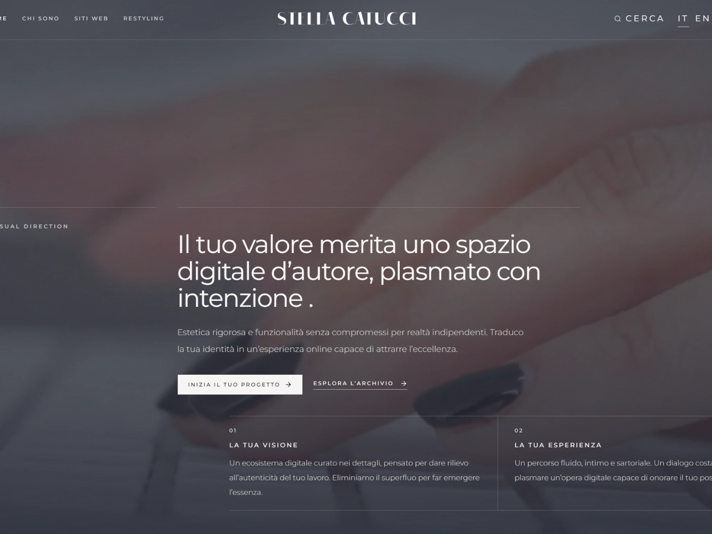
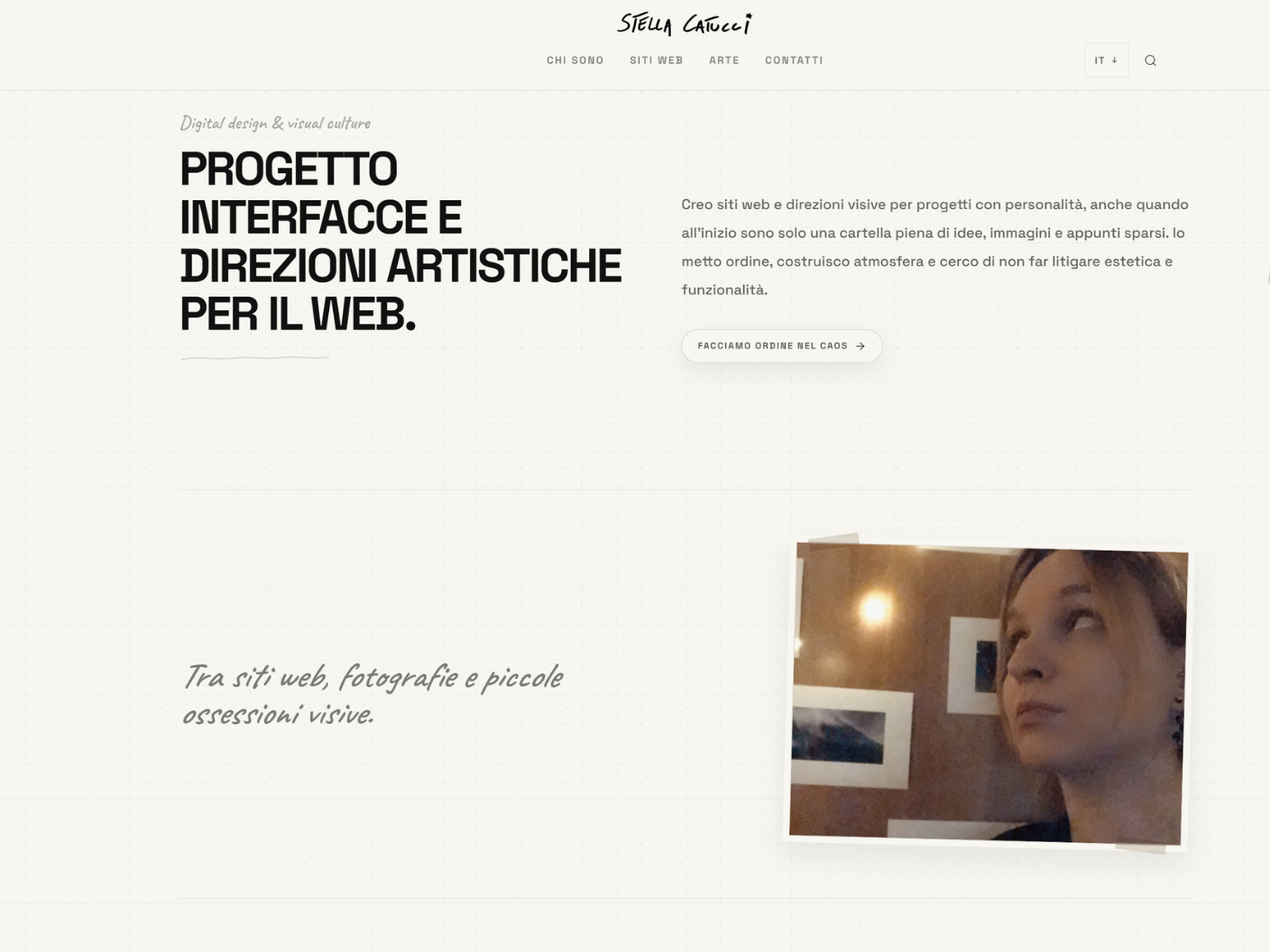
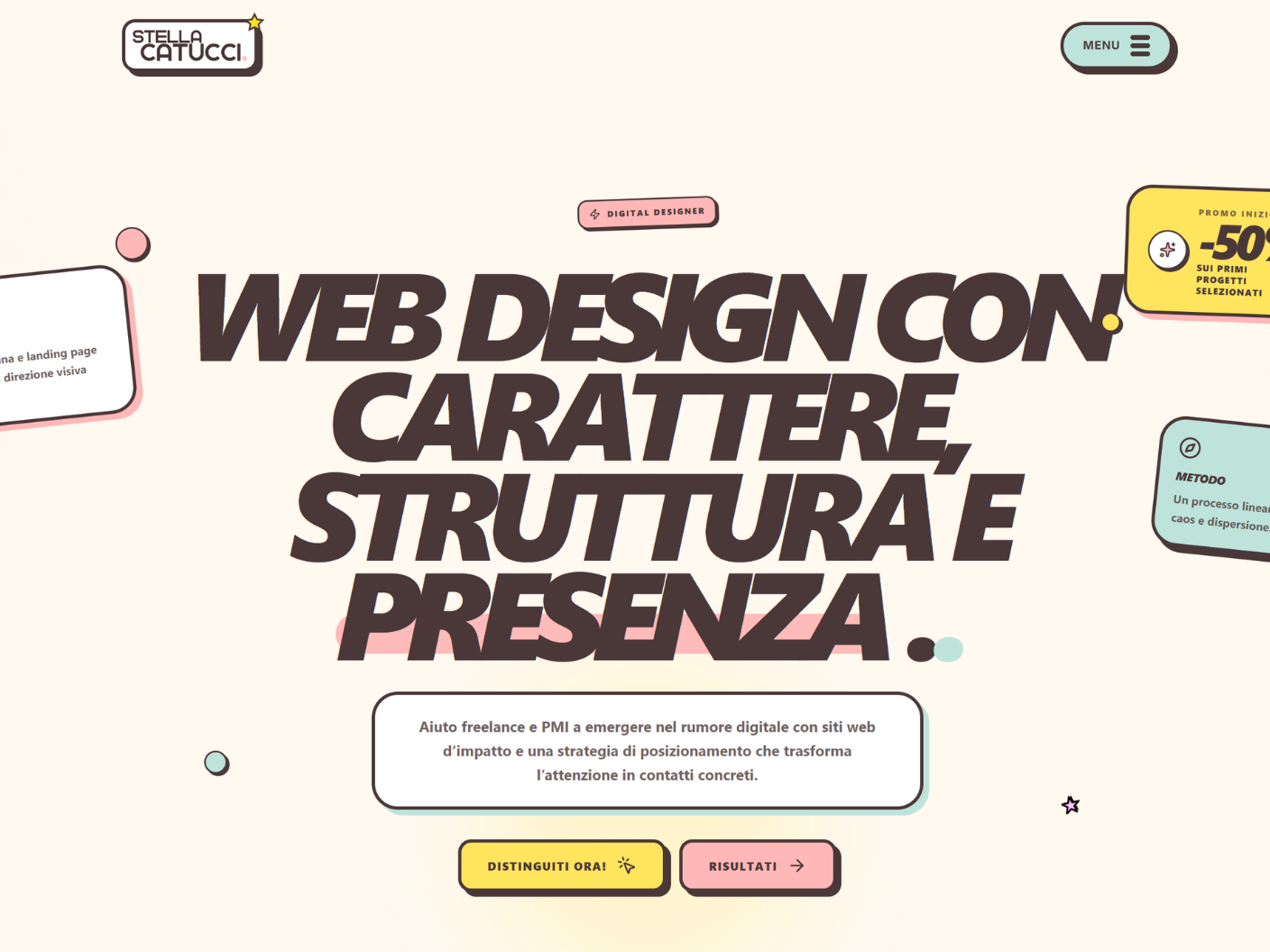
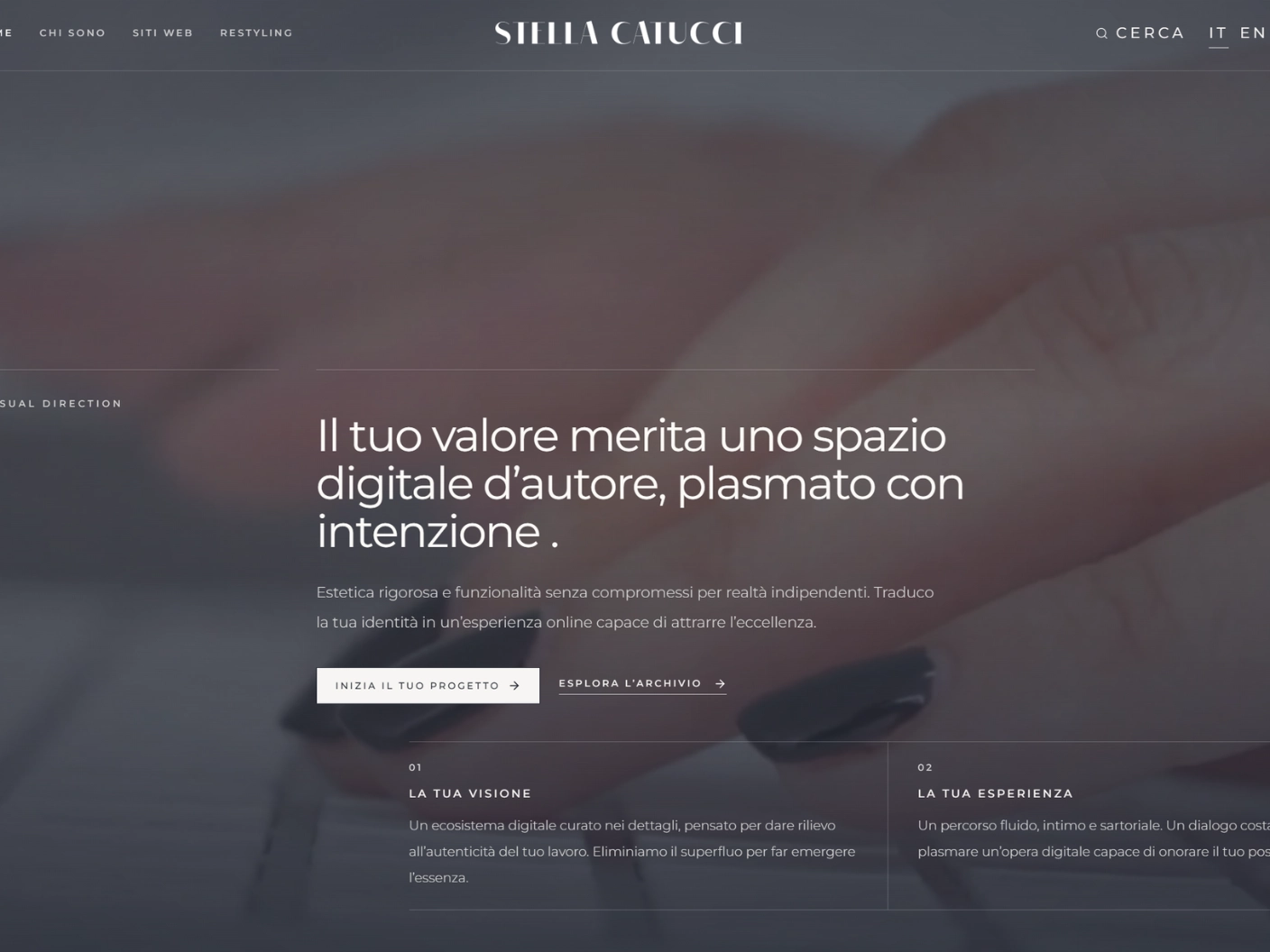
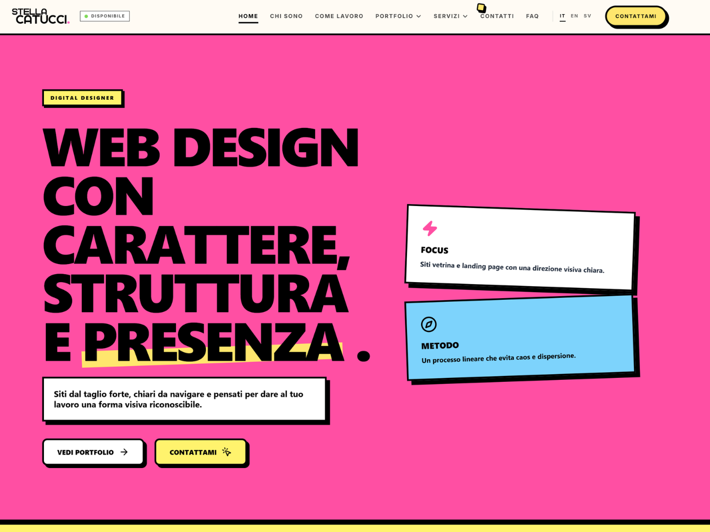
A redesign does not begin by choosing new colours. It begins by looking at the existing website from a little distance: what still works, what creates confusion, and what no longer tells the story of the project it is meant to represent.
For me, redesigning first means reading. Reading the structure, the weight of information, the order in which things appear and the kind of impression a page leaves before someone has even started to use it.
Not everything needs to be replaced. Sometimes it is enough to remove noise, change a hierarchy, give an important piece of content more room or make a relationship clearer. In other cases, the tone itself needs to change, building a visual language that brings the website closer to what the project has become over time.
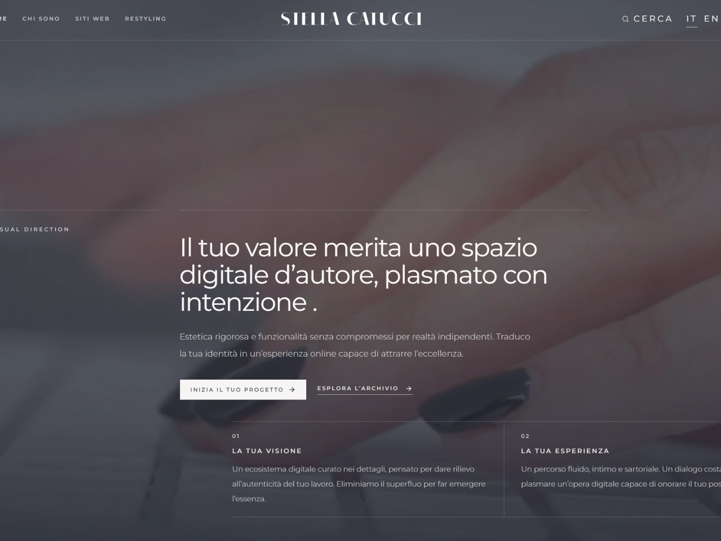
The comparisons below are meant to show that transition. Before and after are the visible result; what interests me most is what happens in between.
Studies referring to external brands are independent visual exercises, not official websites or commissioned work. Trademarks, names, texts, images and related rights belong to their respective owners.